Creative direction
We began with an in-depth brand equity audit, and a competition/market landscape and user research. We reevaluated what the business and brand stand for, and then re-visited Somnia's mission, vision and values, and performed a thorough SWOT analysis. We answered questions like: why does Somnia exist, what problem is the app solving, who is the product for, what will it do, and what features need to be included for Somnia to be successful.
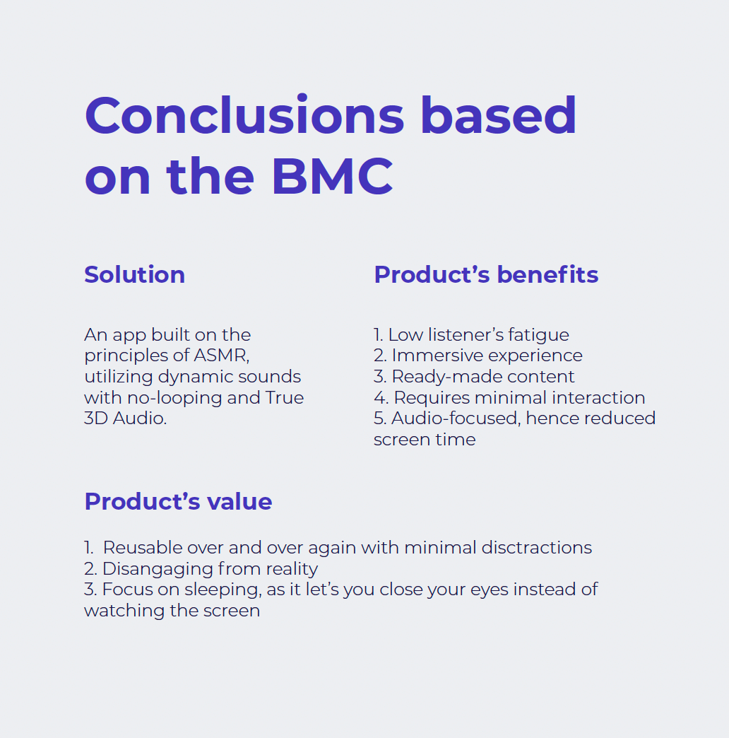
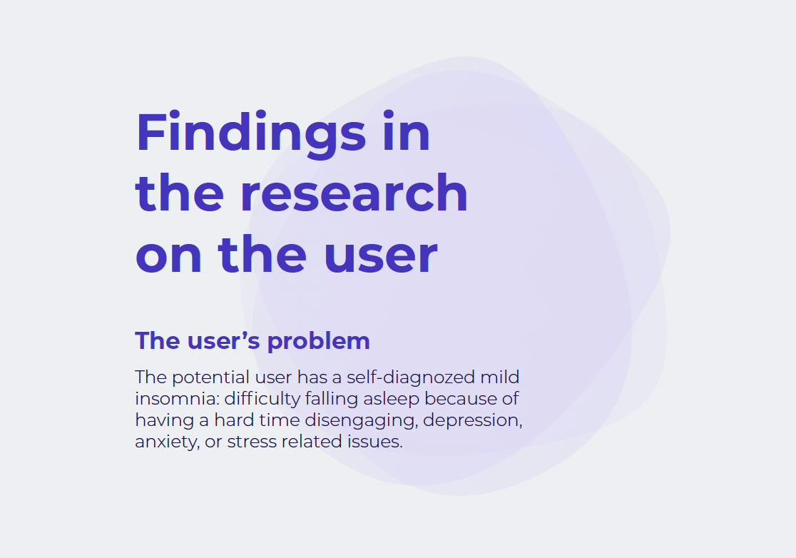
We uncovered the product's value and benefits according to the business model research, and determined what problem we were trying to solve for the users.
Rebuilding and rebranding the app
Using the fundamentals of good UX coupled with brand strategy and design thinking, we rebuilt and rebranded the app. Through this project we embarked on a journey of discovery, ideation and execution so that we can help Somnia:
01.
Reposition on the market by revisiting the brand strategy and user journey, retrinking design solutions, and
ultimately rebranding.
02.
Recover and improve their online presence through redesigning and
developing their landing page, as well as through prototyping the
onboarding screens of the app.
03.
Gain credibility and reputation in order to attract the investors they needed to continue functioning and launching the app successfully.
Improving usability
We started with what it takes for a user to have a good experience:
we aimed
to make Somnia
usable, equitable, enjoyable, and useful.
That meant that the design, structure, and purpose of the product had to be clear to everyone. Next, we wanted to help Somnia become equitable, hence the designs had to be useful and marketable to people with diverse abilities and backgrounds. Our goal was to make Somnia enjoyable to use, and to create a positive connection between the user and the product. We fostered that positive connection by taking Somnia's users thoughts and feelings into account when redesigning the product. And last, but not least, we wanted Somnia to be useful, hence to solve a problem.
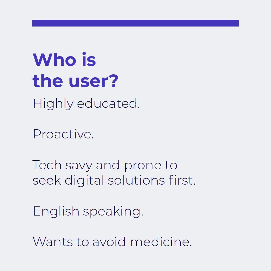
Persona development and user journey
John
John is a 38 years old father of 2. He is a professor and a fitness enthusiast. His goals include falling asleep faster without medication, improve physical health, be a great dad and have plenty of energy.
Caroline
Caroline is a 29 years old doctor from Amsterdam. She enjoys unintentional ASMR such as book flipping. She likes reading, journaling and nature. Her goals are to sleep better, reduce stress, feel pampered and cared for, and better mental health.


Testing
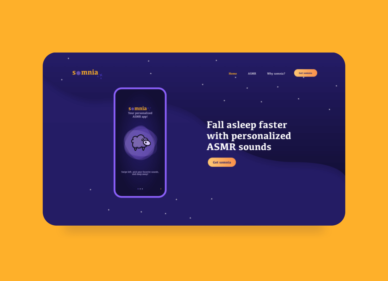
At this test stage, we evaluated the web design based on feedback from potential users. Our goal was for the website to inspire tranquility, a friendly, dreamy and sleepy atmosphere, yet to be modern and professional; to reflect connection, but authority as well. We saw the landing page as the untapped opportunity that we used as a marketing funnel to attract users to download the app directly from the website.
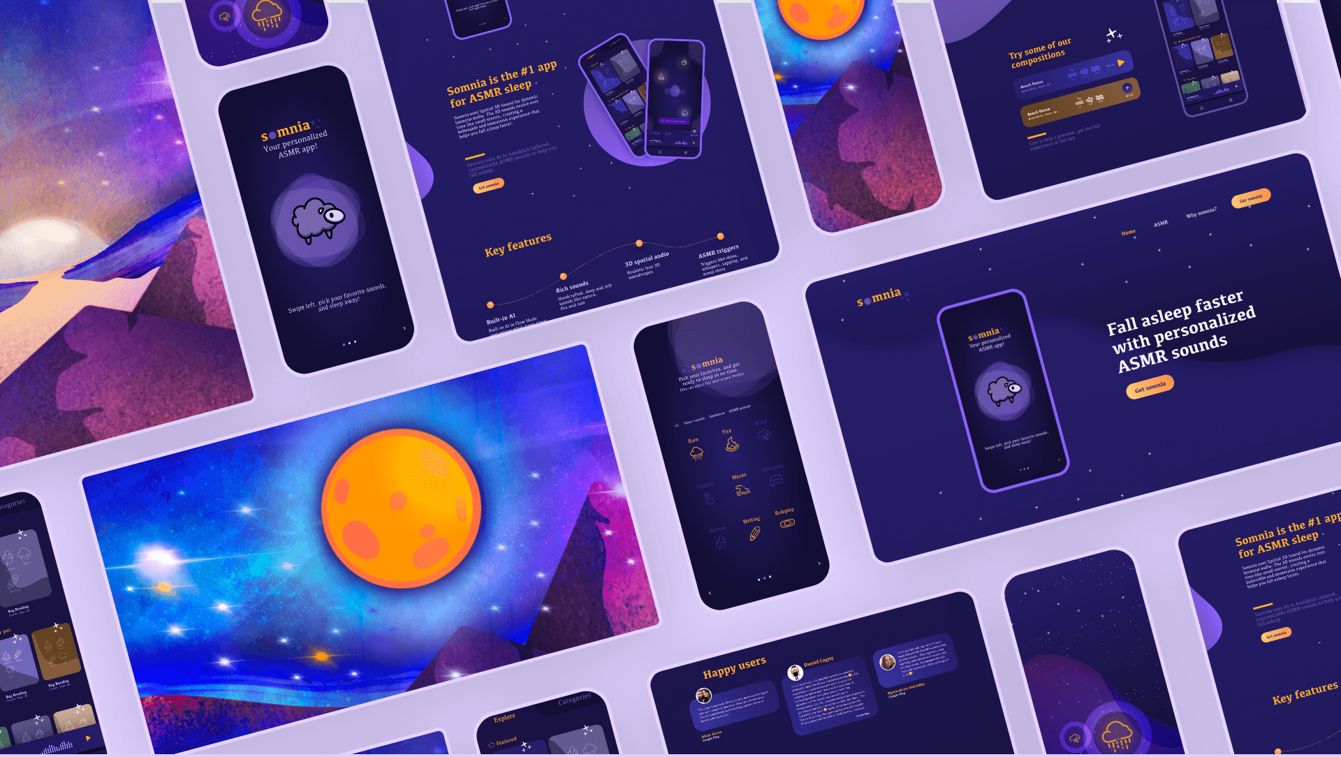
Information Architecture - Web and App Design
We kept the Information Architecture of the landing page almost intact, but with a change in the order in which the sections would be placed on the page.
App Onboarding Design
In the strategy findings it showed that the app needed to be redesigned as well, therefore we created the onboarding screens.
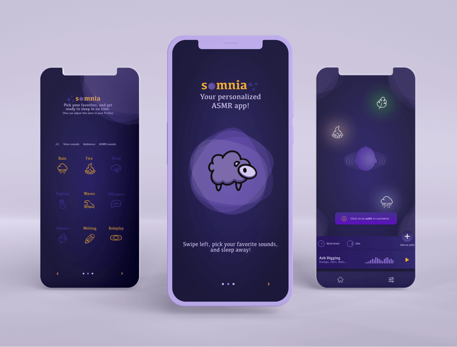
Home screen
This is the first screen the user views once they download the app. It contains the logo, a tagline and instructions on what to do next: "Swipe left..."


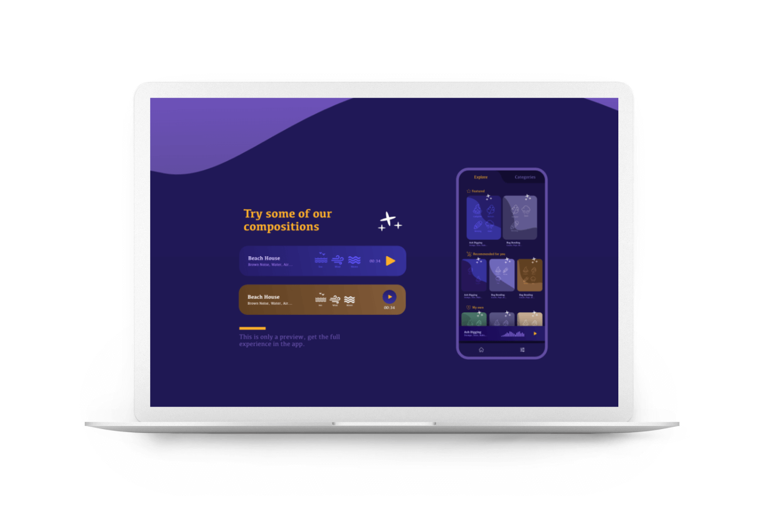
Categories screen
Once the user swipes left, they meet with the categories screen, where they can pick their favorite sounds. This will help define their preferences once "inside".
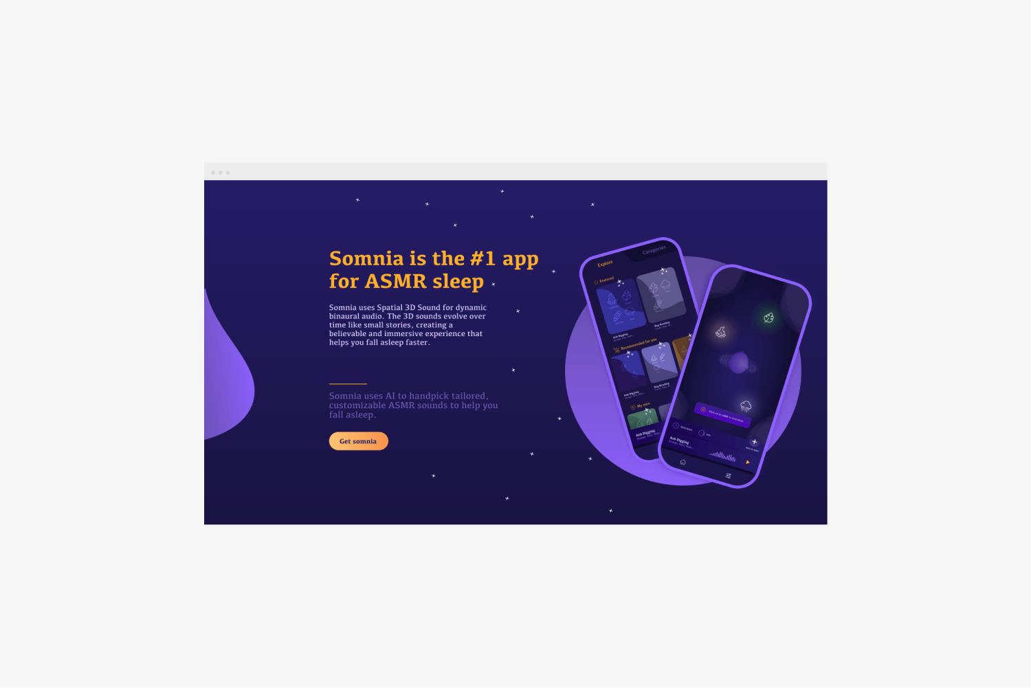
Trial screen
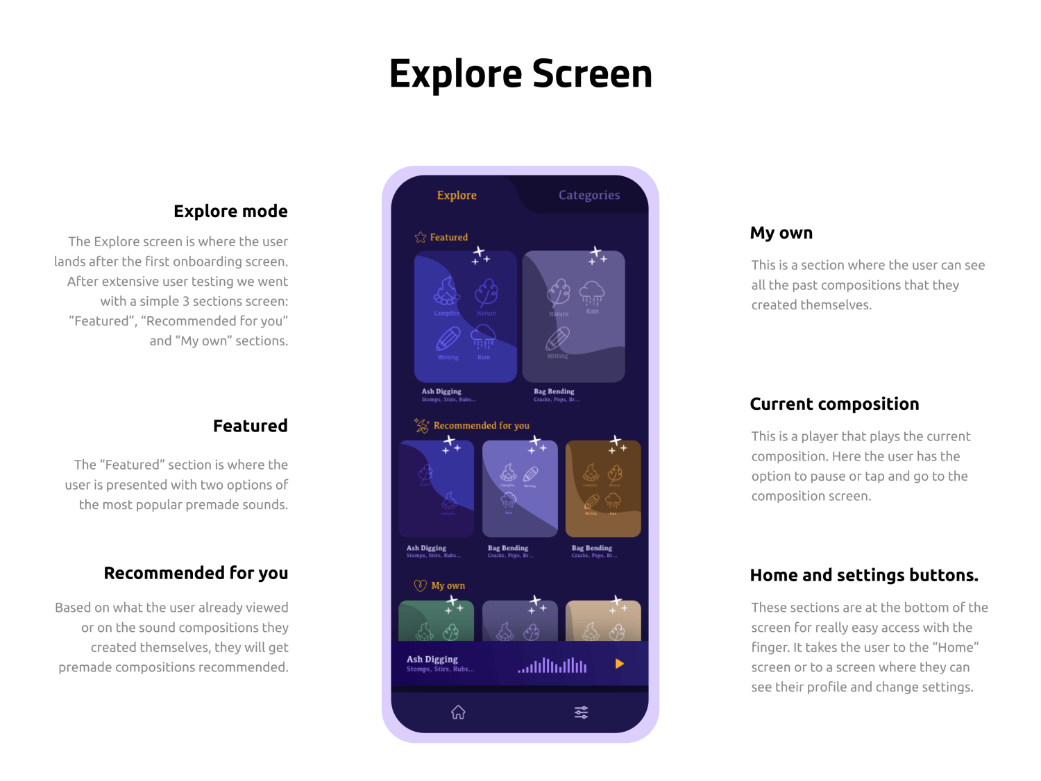
This screen contains the Call-To-Action and the option to continue using the app for free for a daily limited time. The user has the possibility to choose between browsing the premade compositions, which will take them to the "Explore" screen or compose their own.


Custom sounds screen
This is where the user creates their own compositions, as well as listens to the current ones on their list.